Keep an eye on shares with shared code – part 1
Take big data from the stockmarket and parse it into something human beings can understand.
Why do this?
- Make sense of the sea of financial data.
- Do better with your savings than the paltry 1.5% offered by high street banks.
- Fund an extensive collection of red braces.
Many tools for processing data are based on free and open software (FOSS), especially if it’s available online. That’s because the people who write the software are often interested in such things. A few numerate techno-geeks even end up working for banks in the city analysing all kinds of stock market data. They are paid handsomely because their bosses make a tidy profit from financial transactions involving shares. In fact, the image of brace-wearing stockbrokers shouting and waving slips of paper on the exchange floor has become a thing of the past, having been largely superseded by clever algorithms that sprawl across the internet.
Before going any further, we’d like to be clear on one point: this tutorial is not on how to get rich quick by coding and hacking the stock market. Instead, we’re going to focus on getting started with stock market data and examining the history of share price time series. Given the quantity of data involved we’ll need to automate the process, and command line scripting is the ideal tool for the job. Next issue we’ll move on to constructing some basic algorithms and writing code to evaluate trading strategies on past data.
The next step of trading on the real stock market requires either that you do some serious homework, or, better still, take professional advice on the risks and responsibilities involved. There’s also the ethical consideration of whether speculating – frankly, gambling – on shares is harmful to the economy, causing bubbles that burst harming productive businesses. We’ll deftly dodge such thorny issues and concentrate on working with the data.
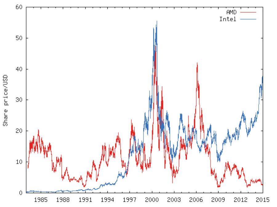
The share prices of AMD and Intel. Buying shares in either one in the early 1990s would have made you a great return if you sold at the 2000 peak, and although both fell sharply after the dot com bubble burst, and again in 2008, the Intel shares have been on an upward trend in recent years.
Take the long view
Before dipping your toe into the sea of data on the web, let’s start by looking at the history of the FTSE 100, which is an index tracking the share price of 100 leading UK companies. It is calculated by taking the average over the total value of shares available for each of the 100 companies, and scaled so that it had a value of exactly 1000 when it began in 1984.
A convenient place to get the data is Yahoo’s finance pages. Fire up your web browser and go to https://uk.finance.yahoo.com/q/hp?s=^FTSE and you’ll see its present value, which will be updated live if trading is open on the London Stock Exchange. Select Monthly from the options on the right, and leave the date range on the left set at its default, which will get the entire history of FTSE 100 data, and click on the Get Prices button. The table will now be updated to show recent monthly values, but let’s get the spreadsheet: scroll down to the bottom of the table and click Download To Spreadsheet.
You will now have a CSV (Comma Separated Variable) file called table.csv in your Downloads folder, but it’s a good idea to rename it to something more meaningful, eg ftse100.csv. The structure is simple enough that you can open it up for a quick look in a text editor, such as Geany or Kate, or a pager on the command line, such as less. Clicking on the icon in your file manager will open it up in your default spreadsheet application.
You’ll see that there are many rows, each one having a date, which will be the first working day of the month (stock exchanges are closed on weekends and public holidays). It will list the price when the stock exchange opened for trading, and when it closed, along with the highest and lowest values between times. For historical analysis, it’s recommended to use the final column, which is called “Adj Close” – this is the close price adjusted to account for important information that came to light after trading.
We’ll start by graphing the data using the standard spreadsheet approach because, for one thing, it’s probably familiar to you, but also it highlights how inefficient this workflow is compared with the command-line equivalent that we’ll describe next. We’re using a recent version (4.x) version of LibreOffice, but the procedure is common to many spreadsheet applications. Click on the A at the top of the Date column, then hold the Ctrl key down and click on G at the top of the Adj Close column. These columns should now be highlighted, but not columns B–F. Now click on the Chart button on the toolbar (or the Insert > Object > Chart menu item). For us, LibreOffice chose sensible defaults for this data and the graph it produced is shown in the boxout.
After inspecting the FTSE 100 graph, and especially after accounting for inflation, you might conclude that investing in shares has been a mug’s game since the year 2000. But you might know that the wealthiest people have seen their wealth increase since 2000, and that they have their wealth invested in shares. This is thoroughly documented in Thomas Piketty’s famous book Capital in the Twenty-First Century. How can we explain this apparent contradiction? The answer is in two parts. Firstly, remember that shares pay dividends, ie they divide the profits to shareholders, so there is a return even if the share price does not rise. Secondly, basing your portfolio on the FTSE 100 companies is a poor strategy; instead it’s better to buy and sell shares from a wider pool to maximise returns. If you have the know-how to do this, or the wealth to pay a fund manager to do it for you, then it’s possible that your portfolio will grow in value even when stock market indices are falling.
There are a few free finance services out there; Yahoo is just one, but it’s particularly easy to extract data from.
Building a portfolio
Extending a portfolio beyond the FTSE 100 is clearly desirable. For example, if we chose to follow the FTSE 250, the index tracking the next 250 most significant UK-based companies, then we’d have enjoyed seeing its index rise from about 1,500 in 1986 to 16,000 in late 2014. A portfolio minimises risks by keeping your eggs spread across many baskets, but also gives you the freedom to swap shares in and out to maximise your returns. Quite apart from any profit incentive, there is the enticing challenge of constructing algorithms to manage the buying and selling of shares. But, before we can do that, we need to mine the huge history of time series data for information.
In case you’re wondering if you’ve picked up a copy of Stock Market Voice by mistake, let’s get back to Linux – specifically, the command line. Clicking around on stock market web pages can soon give you a headache from information overload, and that’s assuming you can see the content – it’s often delivered via Flash, Java and Linux-unfriendly plugins such as Silverlight. You can, as we did above, download CSV files from Yahoo and open them up as spreadsheets. But doing this for the thousands of shares available, and for many rows of data for each one, will gobble time and cause repetitive strain injuries to your mouse hand, eye and brain. Instead, the command line offers a viable path to automation of this workflow.
Let’s start by looking at a famous company – ARM Holdings, which provides the CPUs for most phones and also the Raspberry Pi. To get its data from Yahoo, issue this command:
wget “http://ichart.finance.yahoo.com/table.csv?s=ARM.L” -O ARM.L.csv
This sends a standard HTTP request asking for data on the share with abbreviation ARM.L and writes the returned data into the file ARM.L.csv. There will be a row in the CSV file for every day the share has been traded. As such, it’s rather large, but you can use any of the following commands, and their variants, to help browse through the data:
less ARM.L.csv head -5 ARM.L.csv tail -5 ARM.L.csv cut -d, -f1,7 ARM.L.csv | less
The less command lets you page through the text of the CSV file. The head -5 and tail -5 lines show you the first 5 and last 5 lines of the file. The cut command splits each line using a comma delimiter and outputs only columns 1 (Date) and column 7 (Adj. close), which is then sent to less so you can page through it, though you could send it to head or tail.
If you want to download data for another company, you need only replace ARM.L in the above wget command with its stock market abbreviation. For example, Intel is INTC, and Apple is AAPL. The Yahoo Finance web interface has a Look Up field at its top left which will help you with this.
Let’s take a first step in automating the data download. First, create a new directory and a list of shares that you wish to download and save it into shares.txt. You can list as many shares as you wish, but here’s a concise example of just a few shares:
ARM.L INTC AMD BRCM
Next, create a file called download_shares.sh containing these lines:
#!/bin/bash URL=http://ichart.finance.yahoo.com/table.csv?s= for share in $(cat shares.txt) do wget “$URL”$share -O $share.csv sleep 2 done
To run this Bash script you’ll need to make it executable:
chmod u+x download_shares.sh
so you can run it with
./download_shares.sh
The script takes each line of output from cat shares.txt, so $share becomes the abbreviation used in the wget line, which is used both to append to
$URL and also to name the CSV file for output. The sleep 2 line means that the script waits at least two seconds between sending requests – it’s a free service so a bit of courtesy won’t go amiss.
Once the data is downloaded we can use standard text processing commands to make short work of extracting interesting information. To see all share prices for a particular date:
grep 2014-12-01 *.csv | cut -d, -f1,7
Or to compare the share prices between two dates:
grep “2014-12-01|2010-12-01” *.csv | cut -d, -f1,7
The output from this last command suggests that investing in ARM or Intel was a better bet than either AMD or Broadcom in recent years.
Stock market jargon
Shares The ownership of a company can be split into many small pieces called shares. For example, if MyCorps Inc has a million shares and you have 500,000 of them, then you own half of MyCorps Inc. If the company makes a profit then it will pay out a share of the profit to you, called dividends, in proportion to your share ownership. So if the profit is $10m, you’ll get $5m of it. But this isn’t the only way you can make money. If a company is profitable, or people think it will be so in the future, then they will pay more for a share. So shares in MyCorps that you bought for $1 might become worth $2 and you can sell them and double your money.
The stock market The stock market is a catch-all term for all trading in shares. Some companies only trade in private, but certain companies, called public companies, have shares that can be bought and sold at stock exchanges, such as those in London and New York. We’ll concentrate on public companies because their data is released openly by the stock exchanges according to strict rules.
Stock market index In order to judge how the stock market as a whole is behaving, indices are constructed that track the share prices of groups of large public companies. An increasing index means that most companies have share prices that are rising, and likewise a falling index means share prices are dropping. The most famous indices include the Dow Jones (USA), FTSE (UK), Nikkei (Japan) and NASDAQ (USA technology).
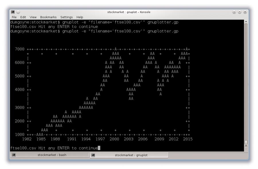
A graph of the FTSE 100 data rendered by Gnuplot in a terminal window. Much detail is lost compared to its graphical equivalent (see above), but it clearly shows the long-term trends of this time series.
Commanding graphs
We can draw some pretty cool graphs from the command line with the venerable Gnuplot. If you don’t have it, you can get it via your package manager for Debian-based distros with sudo apt-get install gnuplot or you can use yum install gnuplot for RedHat derivatives.
You can run Gnuplot in interactive mode, but as our goal is automation, we’ll get straight to writing a quick script for it:
set datafile separator “,” set xdata time set timefmt ‘%Y-%m-%d’ set xtics format “%Y” set key off plot filename every::1 using 1:7 pause -1 filename.” Hit any ENTER to continue”
Save the file as gnuplotter.gp, then run the following command, which tells it to plot the data for Broadcom (though you can use any of the CSV files we’ve mentioned above) and you should see a window open with a plot of the data:
gnuplot -e “filename=’BRCM.csv’” gnuplotter.gp
Note the single quotes inside the double quotes around the filename.
In the first line of the script, we tell it to use commas to separate values on each line of data. The next two lines say that the horizontal axis will be used for time data and the date format is specified. The xtics line tells it to display just the year (%Y) for labels, and the next line tells it not to display a key. Next we have the plot command, which instructs Gnuplot to graph the data with column 1 on the horizontal axis and column 7 on the vertical axis, and every::1 makes it to skip the first line of the file, which is a non-numerical header. Finally, the pause command tells Gnuplot to wait until Enter is pressed before quitting – if you forget this line, the window with the graph will open then immediately close.
If you are a command line die-hard and are disappointed that you have to leave the terminal window, put this line at the start of gnuplotter.gp:
set term dumb
and a graph will be plotted with text characters.
Bring it all together
Let’s put what we’ve seen above into one script so we can quickly review graphs of shares in your portfolio. Enter the following lines in a file called review_shares.sh and save it in the same directory as gnuplotter.gp and your downloaded CSV files:
#!/bin/bash for share in $(cat shares.txt) do head -5 $share.csv gnuplot -e “filename=’$share.csv’” gnuplotter.gp done
Make it executable with chmod and run it, just like we did above for download_shares.sh. Each plot will be displayed in turn and you just hit the Enter key to show the next plot. The head -5 line shows the most recent data to accompany the graph, but you can add lines to display whatever information you wish to see on your portfolio.
Next steps
Although the command line tools such as grep and cut are powerful, they deal only with text and can’t perform numerical operations such as finding minimum and maximum values or calculating averages. If you want to stay close to the command line and augment the above scripts to provide statistics to accompany the graphs, then you could try using awk – it can perform the text functions of grep and cut but can also perform numerical operations. Beyond that, using a full-blown programming language such as Python, Ruby or Perl is probably best.
There is a huge amount of information to digest on the Yahoo Finance pages, and we’ve only scratched the surface of what’s on offer. It’s well worth spending time browsing through it, and if you’re database minded you might find its YQL facility interesting, and if you’re into web apps, there’s an API to play with. It’s also worth going to the horses’ mouths and visiting the websites of various stock exchanges. If you’d like to experiment with simulated buying and selling of shares using real data, there are mobile apps such Stock Trainer that will give you a feel for the workings of the stock market without risking any of your money.
Next issue we’ll turn to turn our attention to devising algorithms to decide when to buy and sell shares.
FTSE 100 history and inflation
This plot (generated by LibreOffice) shows that shares generally rose in price until the dot com crash in 2000, after which share prices recovered until crashing again in the recession of 2008. At the time of writing, the FTSE is back up to about 6500, close to its all-time high.
If you spent a sum of money buying a portfolio of FTSE 100 shares in early 1984, when the FTSE was at 1000, you would have received about six times that amount back if you sold them in early 2000, when it was about 6500. But if you’d bought them at the peak in 2000, then you would, at best, only break even if you sold them at any time thereafter. However, if you account for inflation – the effect of prices of everyday goods rising – a value of 6500 today is not the same as 6500 in 2000. Correcting for inflation, the FTSE 100 would need to be 10,000 if it were to equal its year 2000 peak in real terms.
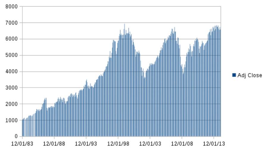
The history of the FTSE 100 stock market index from when it began on 1 Jan 1984 to late 2014.


