gnuplot – command your graphs
When there’s data to process, the command line is still the only way – and that goes for plotting graphs too.
Why do this?
- Script your plots
- A GUI can get in the way
- Check physics, avoid the Matrix
It’s 1990, or thereabouts. Linux is not even a twinkle in Torvalds’ eye and GNU is a six-year old showing real promise. An astrophysics PhD student a few years my senior is sitting at a Sun workstation enthusing about a new plotting program he’s found. It strikes me as being simple yet powerful and also a bit odd. I spend some time learning it, grow to like it and go on to use it to create all the plots in my PhD thesis. But during the late 1990s spreadsheets and other software tools became more powerful and ubiquitous and I fell into using them. However, a quarter of a century later, when writing an article for this very magazine, I stumble across gnuplot again and find, to my amazement, that it’s still being developed and it’s just as odd and useful as it ever was. So, let’s take a look at the curious beast that is gnuplot.
You can get gnuplot with apt-get install gnuplot-x11 on Debian-based distros, including Raspbian, or yum install gnuplot on RPM distros (or if, like me, you use Slackware, it’s installed by default). To start it, open up a terminal window and type gnuplot on the command line and you’ll see some info on the software’s authors and version and be left with a gnuplot> prompt. This tutorial is based on version 4.6, but almost all examples should work on 5.0 too.
Let’s get straight to making a simple graph:
plot x
This will bring up a window that plots the function f(x)=x on the vertical axis with a range of x of between 0 and 10. To change the range, you issue these commands:
set xrange[-5:5] replot
Similarly, to add a label to the x axis you do this:
set xlabel “This is the horizontal axis” replot
In common with many text-based adventure games, you can abbreviate all commands. For example, xrange and be shortened to xr, replot to rep and plot to a solitary p. These abbreviations are great in interactive mode for keeping the typing to a minimum, but they can produce near-unreadable gobbledygook when used in scripts.
Once you’ve learned the basics of gnuplot you can quite often guess commands. For example, there are no prizes for guessing what the following lines do:
set yrange[0:10] set ylabel “This axis is vertical” plot 2*x+3
You can recall previous commands using the up and down arrow keys, just like on a Bash command line, and if you type history you can see a number list of all commands you’ve entered. If you find yourself having adjusted various settings and are confused as to why your plot’s gone bonkers, just type the reset command and that will set many things back to their defaults. Another handy feature is that you can use an exclamation mark to issue commands to the Bash shell, eg !ls will list files in the current directory.
gnuplot’s not GNU
The story of gnuplot’s name is neatly summed up by Thomas Williams, one of its original authors:
“Any reference to GNUplot is incorrect. The real name of the program is ‘gnuplot’. You see people use ‘Gnuplot’ quite a bit because many of us have an aversion to starting a sentence with a lower case letter, even in the case of proper nouns and titles. gnuplot is not related to the GNU project or the FSF in any but the most peripheral sense. Our software was designed completely independently and the name ‘gnuplot’ was actually a compromise. I wanted to call it ‘llamaplot’ and Colin wanted to call it ‘nplot.’ We agreed that ‘newplot’ was acceptable, but we then discovered that there was an absolutely ghastly Pascal program of that name that the Computer Science Department occasionally used. I decided that ‘gnuplot’ would make a nice pun and after a fashion Colin agreed.”
The software was once distributed by the FSF (Free Software Foundation) but it is not now, and uses its own open source, but non-copyleft licence. If you modify the source code you are not permitted to distribute it as a whole, but you may distribute your modifications as patches to the official source code. Full details can be found in the Copyright file provided with gnuplot, and you can learn everything there is to know about the software on its website gnuplot.info. The source code, all written in C, can be found on sourceforge.net. The last release of the software was 5.0 in January 2015.
Getting help
The inline help is excellent and can be accessed by just typing help, or you can find out about a specific command or setting by typing it after help, eg to find out how to customise the tics that mark the x axis, you’d do
help xtics
If you find that help too verbose and only want a reminder of what settings are on offer, use the show command instead:
show xtics
This will display all available options and their current values. If you prefer to leaf through a proper manual, you can download a thorough PDF from the gnuplot.info website, and there are a few published books on gnuplot.
We’ve met two functions so far. Let’s give them names and add a third function for x squared:
f(x)=x g(x)=2*x+3 h(x)=x**2 plot f(x),g(x),h(x)
We’ve called them f, g and h as mathematicians like to do, but you can call them anything, eg Fred(a)=a, Gillian(bob)=2*bob+3 or Henry(tudor)=tudor**2. Note that gnuplot is case sensitive, so fred is different from Fred. Also, although we’ve used bob and tudor as independent variables to define the functions, when it comes time to plot them we have to use x inside the brackets, eg trying to plot Henry(tudor) will cause gnuplot to complain that tudor is undefined.
There are many built-in functions, such as sin(x), the exponential function exp(x) and the natural logarithm log(x). Many of the functions you’d expect are present in gnuplot, with some more obscure ones, such as Bessel functions and even functions that operate on strings like strlen(). To list all available functions, just type help expressions functions.
The inverse square law
A Raspberry Pi, its camera, a lamp and a tape measure are all you need for this experiment. The command raspistill —raw (plus various options to attempt to set exposure) was used to grab an image from the camera and produced a JPEG with embedded raw data, which was extracted using a utility called raspiraw. The pixel analysis was done using Python with the rawpy module.

Data from files
Although it can be fun to play with functions (well, for certain types of people at least), gnuplot’s arguably at its most useful when it comes to plotting data from files. Let’s start with something simple. Enter the following into a file using any text editor and save it as square.txt:
0 0 1 1 2 4 3 9 4 16
Start gnuplot in the same directory as you saved the file and type this:
plot “square.txt”
We found that the markers were rather small on a modern high-DPI screen, but you can easily change that either by adding pointsize 10 after the file name in the plot command, or change it for all future plots with set pointsize 10.
You can check that these data are in fact squares of numbers by plotting a function on the same plot:
plot “square.txt”, x**2
Experimental example
The data in the file can come from anywhere of course, but we’re going to look at some data obtained by placing a Raspberry Pi camera at different distances from a lamp surrounded by a translucent glass shade, which spreads the light over many pixels and prevents saturation.
Our aim here is not to measure properties of the camera, but to perform a simple experiment and, with the help of gnuplot, verify the inverse square law, ie that the intensity of light falls off as the square of distance from the source. More details on how this was done are in the boxout above.
The data is in three columns: distance, number of pixels covered by the lamp in the image, and the
sum of all those pixel values. The data file, saved as data.csv, looks like this:
distance/m,area/thousand pixels,sum/million pixel units 0.5,353,24.1 1.0,87.5,6.02 2.0,21.6,2.82 3.0,8.76,1.35
This is a standard CSV (comma separated variable) format of data, with one header row and four columns of data. We want to plot the distance – the first column – on the horizontal axis, and the second and third columns on the vertical axis. The following commands achieve part of this:
set datafile separator “,” plot “data.csv” every::1 using 1:3 title “pixel sum”
The first line says to use commas to separate values on a line and then in the plot line, every::1 tells it to skip the first line, and using 1:3 tells it to plot column 1 on the horizontal axis and column 3 on the vertical axis. The title keyword tells it to use “pixel sum” as the label in plot’s key.
Now, let’s construct a more interesting plot, which plots all the data plus fits to it, as shown in the boxout over the page:
area(x)=90/x**2 i(x)=6/x**2 set style line 1 linetype 1 linewidth 2 linecolor rgb “red” set style line 2 pointtype 7 pointsize 3 linecolor rgb “red” set ytics nomirror set y2tics set y2range[-4:25] set y2label “pixel sum/1,000,000” plot area(x) title “area fit” ls 1,”data.csv” every::1 using 1:2 title “area” ls 2 ,i(x) title “intensity fit” ls 3 axes x1y2,”data.csv” every::1 using 1:3 title “intensity” ls 4 axes x1y2
The first two lines define functions for our fits to the data. The third and fourth lines define the styles for the red data (definitions for lines 3 and 4, not shown, are similar). The next four lines set up the secondary y-axis, called y2 that is for the pixel sum, which is a measure of intensity. The nomirror line tells gnuplot not to copy tics on to the right-hand y axis, and then we enable the tics on axis y2, set the range and finally set the label for y2. The plot command is getting rather complex, but the only two new features are that the linestyle (ls) is set and also the axes x1y2 is set, which tells gnuplot to use the same x axis but the secondary y axis for these data.
Regarding the results of the experiment, as you can see the area fit is excellent, but the intensity fit is poor beyond 2m. The fact that the area data fits so well isn’t a surprise, because the inverse square law is in fact a geometrical effect that arises because emitted light spreads out over increasing areas as it moves away from its source. The reason the intensity fit is poor beyond 2m is that the camera probably adjusted the exposure to the lower light level (we did try to prevent this, but clearly failed!).
gnuplot’s GUI
gnuplot is primarily a command-driven plotting program, but the developers are not ideological about that, and there is support for point and clicking with the mouse (or other devices).
If you hover the mouse above a point in the plot window, the co-ordinates of that point are displayed at the bottom-left, and a middle click will place a marker. You can place as many markers as you wish, and a replot will clear them all away. To zoom into a rectangular area inside the plot, right-click once to place one corner of the rectangle, and then right-click again to place the opposite corner. Once zoomed-in, the mouse wheel becomes handy for scrolling the view up and down the y-axis, or with Shift held down, along the x-axis. You can undo the last zoom or scroll action by pressing P, and pressing A will undo everything, ie restore the view to its initial state. For these key-presses to work you’ll need to make sure the plot window has keyboard focus, which just requires one click with the left mouse button. Typing the command show bind at the gnuplot prompt will show you all keyboard and mouse bindings, though we found that not all work as expected, probably due to conflicts with the window manager.
Outputs galore
A strength of gnuplot is the number of different ways to output the results, which is controlled by the terminal setting. The default is usually the x11 terminal, but you can list the available terminal settings by typing help terminal. How many you have depends on the compile-time settings of gnuplot, but on my system there are 47 options, from the familiar image formats of PNG and JPEG, to the niche and arcane, such as PSTricks and MIF (maker interchange format). The different terminals are not guaranteed to produce the same results, so if you want to capture the graph exactly as you see it on the screen, your best option might be to take a screenshot.
One very useful option is to output as Scalable Vector Graphics (SVG), which will allow you to scale the graph to any size outside gnuplot later on. First get the graph set up to your satisfaction on the screen and then do the following:
set terminal svg set output “prettyplot.svg” replot set output
This sets the terminal to svg, then the name of the output file, which will go to the current directory (you can specify a full path if you wish), then you send the plot to the file with replot. The set output line at the end is needed to ensure that all data is flushed to the file and the file is properly closed. This is an irritating quirk of gnuplot, but it does allow us to do something that’s useful and fun when scripting.
There are many options that vary from one terminal to the next, but a common one is to specify the size. For an image format such as PNG, you can specify it in pixels, but for the PDF output you can specify the size in physical units:
set term png size 800,600 set term pdf size 10cm,10cm
Possibly our favourite terminal is the one called dumb. This, to the great delight of a command-line jockey, will plot the graph using only ASCII characters in the terminal window.
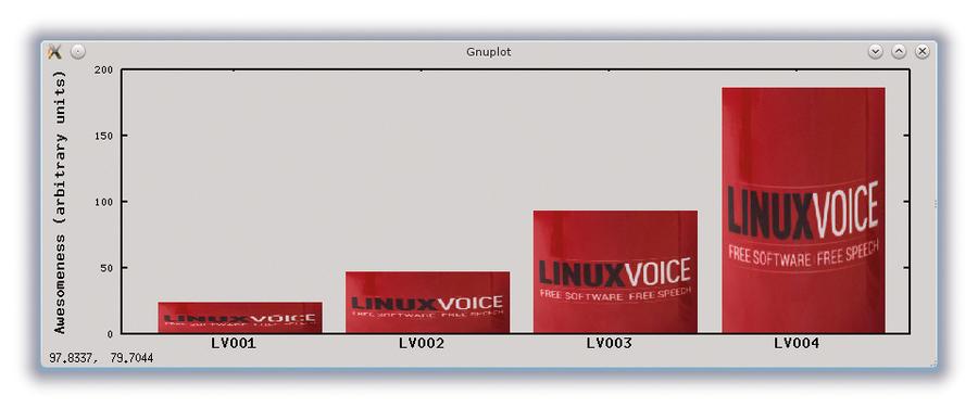
Graphing graphics
Although gnuplot doesn’t produce the prettiest of graphs, a graphically-talented user (so not the author of this article), can achieve something more presentable without too much effort.
set xtics (“LV001” 30.0000, “LV002” 80.0000, “LV003” 130.0000, “LV004” 180.000)
plot ‘lv.png’ binary filetype=png origin=(10,0) dx=0.2 dy=0.1 with rgbimage, …
In this example we produce a bar chart with graphics. First we set xtic labels to appear every 50 units from 30; then use the plot command to place the lv.png image with its lower-left corner by setting origin to (10,0) with the image width multiplied by dx=0.2 and height multiplied by dy=0.1. We can place as many bars as we like by repeating this with different origin and dy values.
Scripting
gnuplot is great for scripting. In fact, you don’t even need to write a script. Once you have your plot set up the way you like, try this:
save “myplot.gp”
Then at some later time you can conjure up your treasured plot with:
load “myplot.gp”
The file myplot.gp is a text file containing a list of gnuplot commands, but the first line will be #!/usr/bin/gnuplot -persist, which means you can run it from the command line if you make it executable, like this:
chmod u+x myplot.gp ./myplot.gp
and voilà, you now have the ability to launch a plot directly from the command line. You can of course write your own gnuplot scripts without using its save command, and any text editor will suffice for this.
Getting animated
Want to make an animated plot? It’s actually very easy. First set up the terminal like this:
set terminal gif animate delay 50 set output “myanimatedplot.gif” set yrange[-10:10] plot x;plot x+1;plot x+2;plot x+4 set output
The first line is the important one: it tells gnuplot we want to create an animated GIF with a delay between frames of 50 hundredths of a second, i.e. 0.5 seconds. On the next line we specify the output file, then we set the yrange to stop the graph’s scale changing in a distracting way. Next we specify the frames of the plot. Here we use semi-colons (;) to separate the plot commands as an alternative to putting each one on a separate line. Finally we issue set output to tell gnuplot we’ve finished writing to the GIF file. If you open up the resulting GIF file in any image viewer you will see a jerky animation of a line moving up the y-axis.
To get a smoother plot, we can unleash gnuplot’s looping commands. You can replace the line with the four plots with:
do for [n=1:4] {plot x+n}
If you change the maximum of n in this loop from 4 to 100, and the delay to 2, then you can create your very own 50 frames-per-second, 2 second long, avant-garde cinematic masterpiece called Levez ligne.
Or, if you have some numerical code that spews out data files, you can script the plotting of them with something like:
do for [name in “tom dick harry”]{ filename = name . “.csv” plot filename title name }
This will load and plot the data from three files called tom.csv, dick.csv and harry.csv and generate the titles used in the key.
Enter the third dimension
gnuplot can do 3D plots with the splot command. For starters, try this:
splot x+y
You will now see a flat, sloping surface shown as a red grid. For each point (x,y), the height – or z co-ordinate – of that red surface is x+y. So at (0,0) the height is zero, for (2,0) the height is 2, and for (3,2) the height is 5, and so on. To appreciate the 3Dness with such rudimentary graphics you’ll need to rotate the view by dragging the mouse across the plot with the left button held down. As with 2D plots, the mouse wheel scrolls the axes, but now pressing and holding the middle button enables you to zoom in and out.
Final thoughts
gnuplot isn’t for everyone, but if you like the command line, and are inclined to think mathematically, which scientists and engineers often are, then gnuplot is a powerful tool. It can used as a plugin to display the results from software with more advanced analysis capabilities, such as in GNU Octave (a Matlab alternative), and gnuplot-py enables you to use gnuplot from within Python.
Exploring data with advanced GUIs and Minority Report-esque gesturing may be cool, and even useful, but there’s only so much you can express by waving your hands around (can you mime a Bessel function?), and that’s why a command-driven and scriptable plotting tool is as relevant today as when it was first created some three decades ago.
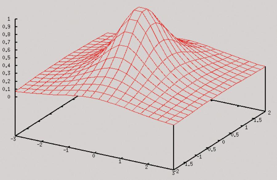
A 3D plot
This example switches on hidden line removal (hidden3d) and increases the sampling of the grid (isosamples) to let you see the peak of the function:
set isosamples 20 set hidden3d set xrange [-3:3] set yrange [-2:2] splot 1 / (x*x + y*y + 1)